Showing posts with label Photoshop. Show all posts

Saturday, November 08, 2008

Loupe the Loupe

One of Photoshop's relatively new tools is the "loupe". This handy previewing tool lets you make judgment calls about one or more photos from the Bridge, without actually opening the pictures in the editor. The loupe technique is faster, and can avoid a lot of hassle with juggling windows and changing zoom levels.

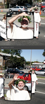
You access the Loupe by clicking on an image in the Preview pane in the Bridge. A rectangular window appears showing a 100% zoom of a small part of the picture. You can drag the window (based on the idea of a jeweller's loupe, a one-eyed magnifying glass) around to examine the most important area of the photo.

One corner of the loupe bulges out, almost like an arrow from a cartoon speech bubble. The arrow points to the spot in the photo that's being magnified, so you can see the scaled-down region and the magnified version at the same time. If the loupe blocks part of the photo you want to see, drag it to the left or right to flip the loupe so the arrow comes out of a different corner.

You can use the magnification to judge whether a photo is worth saving, cropping, or blowing up. For example, you can quickly check whether a wildlife shot has enough detail to be worth cropping and showing at close to original size. You can look at some small detail, like a license plate or sign, to see if it's legible at full size.

Where the loupe really comes in handy is to compare multiple photos. Selecting multiple pictures in the Bridge displays several seriously scaled-down thumbnails in the Preview area. If you took several pictures in quick succession, for example an action sequence where some shots are blurry, or a group photograph where different people have eyes open or closed, picking the ideal one can normally be time-consuming. Put them all up in the Preview pane, open a loupe on each one pointing to the same spot, and quickly decide which ones are too blurry, which ones are too shaded, which one has the best detail for the important region, and so on.

In this example, I put a loupe on 2 photos taken a couple of seconds apart, to see whether the shadows on the face in the first photo are too bad.

A Contrarian View on Color Calibration

Although people say that serious attention to color issues is the mark of a serious photographer, I think these days the "return on investment" isn't great enough to spend a lot of time and energy on it.

The basic issue: screens emit light, printed photos reflect light, so color and brightness that you see on the screen may turn out different in a print. Also, different computer screens (even different operating systems) vary in their display properties, so colors might not be consistent from one machine to another.

For example, when I print a photo at a local location, it will typically turn out a little darker and a little less saturated than it looks on my screen. When my photos (edited on OS X) get projected on a Windows PC at a photo club competition, I know the color balance and brightness will be a little different. And even if I just transfer photos from the iMac to the Powerbook to do a slideshow, the max brightness on the Powerbook still seems dingy by comparison. (Curse this bright iMac screen! ;-)

Old-school photographers often advise a complicated procedure to calibrate your monitor so that it's "accurate" -- the idea being that you'll edit the color balance, saturation, brightness, and so on so that it looks right on the screen, and will reproduce accurately when printed. That's the theory, anyway.

However, there are so many variables to consider that you can drive yourself crazy -- what "color space" is the photo using in Photoshop, what kind of printer are you printing on, what are all the other print settings in Photoshop, how long has it been since you calibrated your monitor because monitors "drift" over time!

And then you transfer the pictures to a computer that wasn't calibrated, or was calibrated differently, or you print on a different printer or type of paper, and once again you don't like the way it looks.

My advice? Follow only the simplest procedures that give the most bang for the buck:

  1. Do a one-time calibration with the simplest, cheapest method. Perhaps borrow a ColorVision Spyder and choose the automated mode where the device rests against the monitor for a few minutes and you don't have to do anything. Or on OS X, use System Preferences -> Displays -> Color -> Calibrate.
  2. Change your display's "Gamma" setting if your images are consistently too dark or too light when printed or on another computer. On OS X, you might find that your images are too dark when displayed on a PC or printed. In the System Preferences ... Calibrate procedure mentioned above, you can set up an alternative profile with a different (darker) gamma value, and switch to it at the drop of a hat. That darker monitor setting will "fool" you into brightening your pictures more than you normally would, which will give better results in print or on Windows PCs.
  3. If you can get a printer profile for your exact printer or your favorite online service, why not. For example, the Dry Creek Photo site has color profiles for many photo labs across the country, including every Costco. You can select the printer profile when printing in Photoshop. (Select Print -> Color Management -> Photoshop Manages Colors to enable the Printer Profile list.)
  4. When you think you have something close, run a bunch of test prints with variations of overall saturation, brightness, etc. Include a caption on each print to say which is which! These days, you can get 8x10s for only a few dollars each. Figure out how much your time is worth to sidestep hours of fiddling with printer settings.
  5. If you find you need to boost brightness by 10%, lower red saturation by 5%, etc. for every picture to get it to display properly on Uncle Bob's laptop or print on your local photo lab's professional printer, set up a Photoshop action, save a set of layers, or find some other way to apply that action to a whole set of photos at once. (Leaving the originals unchanged.) You might display photos in so many different contexts, no one color setting will work perfectly for them all.

Tuesday, January 01, 2008

Signed, Sealed, Delivered

Quick, what's the most boring thing you could possibly photograph during a trip? A sign? Right! Now I will tell you... why you should photograph lots of signs.

Even if you never include any signs in your photo slideshows, just having the pictures as you're sorting through them helps you remember exactly where you were for a sequence of shots. Maybe you did several trails and scenic overlooks on the same trip, and it's useful to know which pictures are from which spot. For famous locales, you might even assign keywords using the tags feature of Photoshop or other photo management software. Be scrupulous in starting every trip segment with a shot of the relevant sign, and you can quickly select a bunch of thumbnails and assign them all the same tag.

When you are doing a slideshow, a quick shot of a sign can help to serve as an establishing shot for the photos that follow. You can skip over it quickly, with just a few words in case the name isn't familiar. It adds more impact than if you just say "next we did the such-and-such trail" -- your viewers will see how long the trail is, the elevation of the peak you're climbing, how antique and ornate the street sign is, and so on.

Our recent trip to The Grand Canyon, Bryce National Park, and Zion National Park really illustrated this point for me. My wife diligently took a picture of the sign at every landmark. I figured, why use up several megabytes on the memory card of my expensive DSLR for a picture of a flat board with some lettering? After all, my wife is getting it in case we need it in a slideshow. Well, now sorting at home through a few thousand pictures, I really wish I had taken some reminders of which pictures are from Rainbow Point and which from Fairyland Point. Or when we did the Queen's Garden trail, did we do the Wall Street branch or Thor's Hammer?

Trying to cross-reference mine and my wife's pictures would be a pain -- the clocks on our cameras are a few minutes apart, and we only adjusted one of them for the right time zone, so combining them and doing "sort by date" wouldn't work well. For a long or far-ranging trip, go into the settings menus and make sure all cameras have identical times to the minute, and are all on the same time zone.

A little skill with the camera menus will also help with memory card anxiety. Practice switching to a lower resolution to shoot the sign (which after all, you're not going to blow up into a poster-sized print), then back to high resolution, RAW+JPEG, or what have you for the other pictures.

OK, trail signs, road signs, what other sign-like things can we think of to shoot?

Take pictures of informative signs about plants, wildlife, and geology. You might use 'em to identify flora, fauna, and landmarks from other pictures. If the sign is too wide and your camera resolution isn't high enough, take separate right and left shots so that you can read the text when you view the picture.

If you have a memorable meal in a restaurant, take pictures of the relevant menu pages. (You can take the menu away with you and do this at home or at your lodging later.) You'll have a reminder of what to recommend to others, or what wine you really liked.

Sometimes taking a picture of a map display, or a printed map, comes in handy later. I've had situations with 2 people and 1 map, the people need to separate, and the mapless person has a picture for safety. Zoom way in and scroll around in review mode if you need to consult the map on the trail or on the road.

One last tip on this subject. Sometimes I'll want to know at what point I changed some camera setting, such as white balance or ISO. I might want to evaluate how well the change worked, or apply some adjustment like color correction to only the photos taken with a particular setting. (For example, lighten all the photos taken at ISO 100; apply warming filter to all photos taken with white balance "cloudy".) I'll take a throwaway photo of a consistent subject (the sky, the ground, my foot, etc.) to signal when I'm making a change like this in the camera settings.

I hope you'll agree that signs aren't really such boring subjects after all!
Friday, November 23, 2007

Photoshop CS3: Problems with Stacks

Although I like the "stacks" feature in the Bridge, as discussed in my last Photoshop post, it's not without flaws. Let's look at things I would classify as problems, or at least unintuitive.

First up, there are 2 operations, "ungroup from stack" and "expand all stacks" that are a little too similar. "Expand" makes all the stacked pictures visible like in the original list of thumbnails. "Ungroup" makes a stack disappear and all the pictures are separate again. If, in a moment of distraction, you select all pictures and do "ungroup", poof all your stacks are gone. I lost a couple of hours worth of tedious work this way, after stacking together zillions of triplets produced by auto-exposure bracketing.

But, you say, "Undo". Sorry, Edit->Undo doesn't work for stack or unstack operations.

The menu operations would be less likely to get confused, if they employed consistent terminology and structure. You've got "Ungroup from Stack" and "Open Stack" right next to each other. "Open" does the same as "Expand All", only for a single stack, so why not use the same verb in each case? To ungroup all stacks you must select all, there's no menu equivalent to "Ungroup All" like there is for "Expand All". So the menu operations are indistinct in terms of what verb is used, and whether you need to select all first.

I wouldn't have been futzing around with "Ungroup" except that the "Group" operation has a problem with keyboard shortcuts. If you select a bunch of separate pictures, Cmd-G groups them into a stack. Select multiple stacks, or some pictures plus another stack, and Cmd-G does nothing. It doesn't work if any of the selected items is already a stack. To do that via the keyboard, you have to ungroup the existing stacks, then add new thumbnails to the existing selection, then group again. Yet you can drag-and-drop separate pictures onto an existing stack, although only when the stack is closed, er, collapsed. So a mouse operation doesn't have a keyboard equivalent, even though it would make sense for Cmd-G to handle the case of merging or adding to a stack.

The online help says that selecting the top picture in a stack means that operations apply to all pictures in the stack. But that's only true if all the pictures in the stack are selected, which they are when you first group them, or if you click on the thin 3-D border around the right and bottom sides. So in experimenting with stacks, I ended up with several cases where labels or keywords intended for the whole stack were only applied to the topmost photo. Also, when you mouse over the bottom region of the border, a tooltip comes up that obscures the whole clickable bottom area, so in practice it's only the right part of the border that you can use for selecting the stack.

The Bridge can be sluggish to process input events. A number of times, I've done a Group or Open operation on a stack, selected other pictures and done Cmd-G to group them, and had the Bridge decide I really wanted to open those pictures in Photoshop. So even though stacks save time overall, while putting them together you have to pause between clicks to give the Bridge time to catch up.

One nice feature of stacks, related to the drag-and-drop idea, is that you can stack photos that aren't in sequential order. Have you ever taken several shots of some landmark, taken shots of something else, then more shots of the first subject? (Anyone who has photographed Half Dome in Yosemite knows what I'm talking about here.) With a stack, you can put all the pictures of that one subject, even from different days, into one pile where it's easy to pick out the best one. Or, once they're in a stack, you can give them the same keywords or label.

Saturday, November 17, 2007

Photoshop CS3: Looking Back vs. Charging Ahead

I just had my first in-person Russell Brown seminar, where he demonstrated some of the nifty features in Photoshop CS3. CS3 is the first release in a while that's tempted me, since CS2 is so unusably slow running emulated on an Intel iMac. With CS3, the Bridge + Photoshop combo is actually fast enough to make sense to make them separate programs, and some of the processor-intensive features like HDR and Photo Merge run in reasonable time.

I was struck by the way several of the features have to do with that scary 4th dimension -- time! That's a trend I'm seeing a lot lately across many types of software (cf. "Time Machine" in Leopard, "flashback query" in Oracle).

On the one hand, CS3 will make you want to go back and re-examine pictures you thought you were finished with. The enhanced Photo Merge makes doing panoramas a snap, with very good auto-aligning and even auto-blending to match colours across the different pictures. If you're like me, you have tons of photos filed or tagged with the intent to turn them into panoramas later, but the process was tedious and error-prone enough that it never seemed worth the trouble.

Also, you can bring JPEGs into the Camera Raw editor and apply some of the settings (sharpening, white balance, chromatic aberration, etc.) in there. The information gets stored as metadata inside the JPEG, and applied only when the file is opened in Photoshop. I expect it will be a big space-saver vs. taking every halfway decent JPEG and turning it into a 20+ MB PSD file just to improve levels and saturation.

If those were the only features, you might say CS3 is a time sink, because you're just going to go back over your old pictures. But with the ability of the Bridge to group pictures into "stacks" (similar to the feature by the same name in Aperture), you can display a folder full of images and see just the unique shots -- all 50 shots of the same waterfall, bird, etc. can be condensed into one thumbnail in the Bridge, and you can work preview the pictures in a stack together and pick the best one. This should prove especially useful for:

* Auto-exposure bracketing where you have 3 copies of every shot.
* Portrait and landscape versions of the same scene.
* Wildlife shots with many close-together pictures of the same animal.
* Individual frames from panoramas, which can be collapsed into one thumbnail entry.

With stacks, you can do your ranking in 2 stages. First, pick which compositions and subjects deserve a place in the final portfolio, then pick which exposure, orientation, or moment in time is the best for each stack. If that faraway bird was just a speck in all 50 photos, just disregard that stack; the individual pictures won't get in the way of critiquing the rest of that folder.

Sunday, November 11, 2007

A Photo that's Too Good to Win

Here's a picture that I figure should do well in several competition categories. It did OK in Nature and Pictorial at the local club.


Yet when entered in a regional competition, the judge ruled it out saying "It looks like something was done to the wings", i.e. Photoshopping outside the rules. That's a Catch-22. The wing detail popped out after I did just the normal (allowed by the rules) amount of Photoshop sharpening. I sharpened the picture as a whole. The startling translucent effect is because the bird in flight is actually shot from above -- a very unusual angle -- with the afternoon sun hitting the wings from side-on. What am I supposed to do, put all that in the title?!

Wednesday, November 07, 2007

Watermarking Pictures in Photoshop

I've just started using this technique for watermarking photos, like the Carousel picture in the previous post. If you've only done photo retouching with Photoshop, this technique opens up the whole new world of text rendered as vector objects, paths, and all those layer styles and options like drop shadow, bevel, and so on. Until you lay down some text on a picture, all those things don't have much use.

I've saved my original watermark as both a custom shape, and as a single layer in its own file. The custom shape can easily be stamped onto any picture, while the layer can be dragged from the layers window onto another picture (carrying along all the layer options).

Monday, July 16, 2007

Be Not Afraid of Auto-Levels

Don't scoff at the "Auto" button in Photoshop's Levels dialog. Although it might seem designed for newbies who can't work a slider, it can come in handy no matter what your level (no pun intended).

Pick a photo that could use some punching up. (I shoot with a Canon 20D, which tends to undersaturate and undersharpen, so for me this is essentially any photo. :-) Create a new Levels Adjustment layer. Click "Auto", "OK", and just gaze for a minute at the result. You might see the color balance shifted way too much, or an excess of contrast or saturation.

But even if the end result is garish, Photoshop is at least showing you what direction to take. Back in the Layers dialog, select this new layer and gradually lower the opacity slider. If the Auto Levels adjustment made the color balance way too green, probably it needed to be just a little more green; if it supersaturated the colors, probably they could do with a little more saturation. Don't feel embarrassed to lower the opacity to 30%, heck even 10%, until visually it looks improved from the previous version.

With some more practice eyeballing your photos with such a layer visible and hidden, you'll develop a feel for when to apply some extra contrast, saturation, or shift the color balance. But until then, feel free to achieve the same effect via a low-opacity "Auto Levels" layer.

Friday, April 13, 2007

Two-Handed Input with the Apple Remote

The future of user interfaces is in our hands, literally. Both hands. A lot of people are saying the way forward is multi-touch input on the screens of devices like the iPhone. I say, don't forget about the Apple Remote which is here right now!

When I worked at IBM Canada, I attended a talk given by Bill Buxton, who was doing UI research at Alias|Wavefront at the time. Bill is heavily into multi-touch interfaces. He described some gestural interfaces and two-handed input techniques employed by artists at alias, and that idea really struck a chord with me and has stayed in my mind ever since.

Fast forward to 2007. In photography, I'm losing patience with the tradeoffs between DSLRs and point-and-shoots, and have started using a two-handed, two-camera shooting technique for combined landscape/wildlife outings. At home, I have an iMac with an Apple Remote, and have started using the remote with Mira, a driver that lets the remote control any application.

At first, the remote seems like a good way to cut down on eye and wrist strain; it replaces the mouse for dead-simple interaction that shouldn't require hunching over the keyboard. I set up Firefox shortcuts so the remote can boost the font size, page up / page down, and close the current window. That way, open a bunch of tabs and then sit back and read 'em at a comfortable distance on the 24" screen. I set up shortcuts for image-viewing applications to go full-screen, forward/back, and delete the current picture. Then it's much simpler to cull the bad pictures from a picture-taking trip.

But as I ponder my most laborious interactive tasks, I realize that the remote can supplement the mouse by working in concert. In Photoshop, I can make remote flag, delete, launch, and do other common operations that usually involve double-clicks, multiple keystrokes, or widely spaced menus and icons. I still need the mouse to select the photo to act upon. Mouse in one hand, remote in the other, I'm a whirling dervish of photographic productivity.

It would be even better if Mira could adapt its remote functions based on which Photoshop window was open: in the Layers menu, do this and this, in the Levels dialog do that and that. I'll suggest that to the fine folks at Twisted Melon. Another multi-use sort of app is iTunes; half the time I want the usual Play/Pause/Next controls, half the time I want to assign ratings or edit metadata using shortcuts.

Other challenges await. A lot of programming work already involves cursoring up and down and copying and pasting. Maybe I can come up with a set of mappings for OS X's Terminal. I'm sure Mail.app will go faster when one hand selects a message and the other chooses from half a dozen actions on that message.

Now that I think about it, possibly the finest days of multi-handed input for the average person came in the '80s with the Commodore 64. I remember using a light pen, Koala Pad, and game controller spinning knobs all in the course of a day. Today, the parallels are a Wacom tablet, that glowing knob/button whose name I forget, and the Apple Remote. Ah, if only the infrared sensor could record position like a light pen!

Saturday, December 30, 2006

Photoshop Tip for OS X: Use Aliases for Sorting and Sifting

This tip is all about ways to categorize pictures in multiple ways, without wasting space with multiple copies.

One of my big challenges with photography is figuring out what pictures to use in different contexts. When I come back from a trip, I might want to pick one batch of pictures to print, and different batches to enter in camera club competition, turn into panoramas, and so on. Yet I'd also like to dump the whole batch of originals into one directory for ease of backups and viewing thumbnails.

The way I have settled on organizing these different categories is with OS X's "alias" feature. Drag and drop one or many files while holding Option and Command, and OS X will create tiny files that point back to the originals. (The icons have little curved arrows in the lower-left corner.) Photoshop can work (reasonably well) with aliases; you can view their thumbnails and open them for editing. What I typically do is "Select All" in my Originals folder, and Option-Command-Drag all the files to a different folder. If it's easy to select a group of files, like a sequence of pictures all of the same subject, I'll only select those files before dragging. The other folder will be something like "Panoramas", "Black and White", or camera club competition categories such as "Travel" or "Pictorial".

Once these folders are full of aliases, I can look at the thumbnails in Photoshop. At this point, the Trash Can becomes my friend. As I decide which photos are relevant for each folder, I can trash all the others through Photoshop or the Finder. The alias goes in the trash, not the original file. If the choices are not obvious, I keep a large set of aliases in the folder and flag only the ones I think are best. This way, the same picture can be flagged in one category, but not in another.

Aside from the freedom to trash pictures without losing the originals, using aliases has two main benefits:

You can use the same pictures in many different contexts without creating separate copies. I always wait until the pictures are converted to PSD before copying aliases. Each PSD is on the order of 20 MB. So it wouldn't be practical to file separate copies under Travel, Nature, etc.

Any edits you make to the picture, either through the original or one of its aliases, are reflected everywhere. For example, if you improve the contrast while preparing a photo for a camera club Nature competition, you'll see that same improvement when you go back to the Originals folder to make a slideshow. Any dust removal, Levels, and so on only needs to be done once. For pictures that I want to try as black and white, I'll create the Channel Mixer adjustment layer, but turn it off before saving, so the B&W effect does not show up in all the other folders.

I find that having folders of just the relevant photos is more convenient than assigning keywords in Photoshop for all the different categories and doing a keyword search -- less typing, fewer dialogs, and the finality of trashing photos that didn't make the cut is reassuring.

Now, Photoshop's support for aliases is not perfect. Although you can do things like flagging and ranking, where Photoshop remembers your choice, you can't go through aliases to assign metadata that's stored in the file itself. So any keyword assignment has to be done using the originals. I'll typically go through a folder of pictures from Yosemite and assign relevant keywords like Deer, Hawk, etc. and then filter by keyword to identify all the pictures to create aliases in my Wildlife folder.

The other big drawback with Photoshop's alias support is that you can't run a batch operation on aliases you've selected. If you want to boost the saturation of every picture by using Automate->Batch and an action, you've either got to go back to the originals, or open all the files and choose Opened Files in the batch dialog.

When sending photos to get printed, you typically need to crop them to a particular aspect ratio such as 4x6, 5x7, or 8x10. Although you can sift through aliases to pick out candidates for printing, be careful not to save the cropped version and overwrite the original. What I typically do is to make a selection using the Marquee tool with a fixed aspect ratio, and then do Select->Save Selection and give it a name like "4x6 Crop". I might even save more than one selection if I plan to make both a snapshot and a framed 8x10 of the same picture. I save the uncropped version after doing "Save Selection", so that I have the full-sized original, but at any time I can load it, load the selection, crop and save the cropped version under a different name for printing.

Saturday, December 16, 2006

Photoshop Tip: Semi-Opaque Adjustment Layers

When exactly would you use an adjustment layer that's not at 100% opacity? Seems like a silly thing to do. If the effect didn't turn out exactly right, wouldn't you just re-do the layer from scratch or tweak its slider settings?

That's the way I worked for a long time, and still do in most cases. But there are certain times when it makes sense to create an adjustment layer that goes too far, then dial it back a little by lowering the opacity using the slider in the Layers window. That's a different technique than, say, applying a gradient to a layer mask to darken the sky but not the foreground.

When a photo has a colour cast, the natural adjustment is to do a Levels layer and set the Gray Balance. However, sometimes the photo doesn't really have any gray -- the rocks, street, or whatever is made out of the wrong-coloured material, is under reddish sunset light, and so on. In this case, pick the closest-to-gray colour to apply the Gray Balance, which will swing the whole photo too far towards blue, yellow, or sometimes magenta. Instead of endless re-doing the Gray Balance looking for an elusive speck of pure gray in the photo, lower the opacity of the Levels layer until you find the accurate-looking percentage.

When a subject is a little too dark, but the background is pretty much the right brightness, I like to apply a "spotlight" effect by doing a Levels layer and using a circular gradient for the layer mask, centered on the person's face, their whole body, or whatever subject is too much in shadow. But sometimes, the Levels adjustment that makes the subject look realistic is too bright to blend well with the rest of the picture. In this case, lower the opacity of the Levels layer until the falloff in brightness is imperceptible. You'll still have the "ideal" Levels adjustment setting that you can apply if later you decide to sacrifice the background by brightening the whole picture.

Saturday, December 09, 2006

Photoshop Tip: John's Shortcuts for Cropping

With a 24-inch screen and a DSLR that takes super-sized pictures, cropping is more of a concern than it used to be. Here's some Photoshop advice to make the process simpler.

  • Use the Marquee tool to make a rectangular selection, then the Image->Crop menu choice, rather than the Crop tool. Using a selection gives more flexibility than the Crop tool, for example the ability to make a selection with a fixed size or to save selections as alpha channels.
  • If you plan to make a photo print of the picture, make a selection with a fixed aspect ratio of 6x4, 7x5, 10x8, or whatever dimensions you plan to use for the prints. Reverse the numbers for pictures printed in portrait style, i.e. taller than wide.
  • If you need to have different-sized crops of the same picture -- for example, to print both a 4x6 and make an 8x10 enlargement -- make the selection and choose the Select->Save Selection menu item. Save the selection as an alpha channel. You can make several selections this way with different sizes, save them as part of your .psd file, then later do Select->Load Selection and Image->Crop. Just remember to always save the file under a different name after you've cropped it.
  • If you will be projecting the photo or displaying it on a laptop, crop using an aspect ratio that matches the projector or laptop. For example, my local photo club uses a projector with 1024x768 resolution, so I crop competition photos to an aspect ratio of 4x3. That way, I can always resize the cropped image to 1024x768 and not lose anything.
  • For pictures where the subject doesn't take up a lot of the frame, such as a wildlife shot taken from a distance, consider doing an initial crop to match the dimensions of your monitor. You'll need to use the rectangular Marguee technique with options set to a fixed size. That way, you can do the rest of the work looking at the picture at 100%, and only later decide whether to crop even more. This technique works best if your screen resolution is greater than on the projector, laptop, etc. where the picture will end up. For example, I do my photo editing on a 1900x1200 screen but typically display slideshows on a 1280x960 laptop. If I am reviewing and working on dozens of surfing pictures where the surfer is surrounded by lots of ocean, I can work faster and save disk space by cropping out lots of blue. Using an absolute size of 1900x1200 means I don't have to worry about cropping out too much, there's always some excess to trim later.
  • Once you've made a selection, you can preview how the cropped version will look by pressing Q to go into Quick Mask mode. The part of the picture outside the selection turns red, so you can visualize how the photo will look without the extra parts, the same as when you select with the Crop tool and it darkens the unselected portion. Quick Mask mode has many other uses, but for cropping purposes, just press Q again to go back to normal.
  • Once you've made a selection, you can resize or move it with the Select->Transform Selection menu choice. Press Enter once you are satisfied. By default, the transformation ignores any size or aspect ratio options; hold down Shift while resizing to keep the selection consistent with those options.
  • I find it inconvenient not to have keyboard shortcuts for Image->Crop and Select->Transform Selection. In Photoshop CS, you can assign your own keyboard shortcuts with Edit->Keyboard Shortcuts. Photoshop already has shortcuts using most combinations of letters and modifiers, but whatever operations used Shift-Command-C and Command-T, I never used 'em and so reassigned them to Image->Crop and Select->Transform Selection.

Friday, November 03, 2006

Can I See Clearly Now?

Previously, I did some monitor calibration by eye using various test charts. I finally tried out some real calibration equipment (the Gretag Macbeth "Eye One Display 2"). Now, I know someone in the business of high-end color management who scoffs at all the consumer-level products. So my expectations are not sky-high.

Running through the wizard on the Easy setting turns out to be a snap. Just hang the mouse-like contraption over the front of the monitor, let the software flash different colors on the screen to be measured by said contraption, and it's done. Watching the software do a binary search with white and black squares to locate the sensor against the screen is kind of entertaining.

I read one review (ehhh, can't find the link now) that concluded that the Eye One Display actually was more accurate on the Easy setting than the Advanced one, so I left it at that. (Ran the process on new 24" iMac, old 15" iMac, and old 15" Aluminum Powerbook.) I can say that, subjectively, I do see some difference, with reds and blues looking a little deeper. The real test will be working with skin tones, gently graded skies, and high-contrast scenes.

My skepticism about color profiling comes from the fact that most color problems I experience are rooted in the camera (3x Canons). The S30 takes pictures that are a little too saturated. The G3 tends towards too much yellow in the color balance in any kind of tricky lighting. And The 20D oversaturates the reds (by about +15 in Photoshop terms) in any picture with big patches of red.

After a couple of days of use: I am actually seeing over-saturated reds now on the monitors, both flesh tones in news photos and solid red patches in GUI apps. The next test will come on Tuesday, when I'll have a couple of post-calibration images projected in the local camera club competition.