It's good to see community-based tagging evolving to include images too. As a photographer, I enjoy browsing gallery sites with a wide variety of images, to get new ideas and explore new perspectives. The sites mentioned in this blog post (WeHeartIt, Fffffound, and Visualize.us) stream pictures that have been tagged by users, so you can explore by serendipity, or drill down by tag.
Tag That Image: Visual Bookmarking Sites Worth Browsing - Bits Blog - NYTimes.com
There are other sites (like ImgFave) mentioned in the comments too, so they're worth reading.
Saturday, November 29, 2008
Saturday, November 08, 2008
Loupe the Loupe
One of Photoshop's relatively new tools is the "loupe". This handy previewing tool lets you make judgment calls about one or more photos from the Bridge, without actually opening the pictures in the editor. The loupe technique is faster, and can avoid a lot of hassle with juggling windows and changing zoom levels.
You access the Loupe by clicking on an image in the Preview pane in the Bridge. A rectangular window appears showing a 100% zoom of a small part of the picture. You can drag the window (based on the idea of a jeweller's loupe, a one-eyed magnifying glass) around to examine the most important area of the photo.
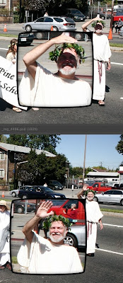
One corner of the loupe bulges out, almost like an arrow from a cartoon speech bubble. The arrow points to the spot in the photo that's being magnified, so you can see the scaled-down region and the magnified version at the same time. If the loupe blocks part of the photo you want to see, drag it to the left or right to flip the loupe so the arrow comes out of a different corner.
You can use the magnification to judge whether a photo is worth saving, cropping, or blowing up. For example, you can quickly check whether a wildlife shot has enough detail to be worth cropping and showing at close to original size. You can look at some small detail, like a license plate or sign, to see if it's legible at full size.
Where the loupe really comes in handy is to compare multiple photos. Selecting multiple pictures in the Bridge displays several seriously scaled-down thumbnails in the Preview area. If you took several pictures in quick succession, for example an action sequence where some shots are blurry, or a group photograph where different people have eyes open or closed, picking the ideal one can normally be time-consuming. Put them all up in the Preview pane, open a loupe on each one pointing to the same spot, and quickly decide which ones are too blurry, which ones are too shaded, which one has the best detail for the important region, and so on.
In this example, I put a loupe on 2 photos taken a couple of seconds apart, to see whether the shadows on the face in the first photo are too bad.

A Contrarian View on Color Calibration
Although people say that serious attention to color issues is the mark of a serious photographer, I think these days the "return on investment" isn't great enough to spend a lot of time and energy on it.
The basic issue: screens emit light, printed photos reflect light, so color and brightness that you see on the screen may turn out different in a print. Also, different computer screens (even different operating systems) vary in their display properties, so colors might not be consistent from one machine to another.
For example, when I print a photo at a local location, it will typically turn out a little darker and a little less saturated than it looks on my screen. When my photos (edited on OS X) get projected on a Windows PC at a photo club competition, I know the color balance and brightness will be a little different. And even if I just transfer photos from the iMac to the Powerbook to do a slideshow, the max brightness on the Powerbook still seems dingy by comparison. (Curse this bright iMac screen! ;-)
Old-school photographers often advise a complicated procedure to calibrate your monitor so that it's "accurate" -- the idea being that you'll edit the color balance, saturation, brightness, and so on so that it looks right on the screen, and will reproduce accurately when printed. That's the theory, anyway.
However, there are so many variables to consider that you can drive yourself crazy -- what "color space" is the photo using in Photoshop, what kind of printer are you printing on, what are all the other print settings in Photoshop, how long has it been since you calibrated your monitor because monitors "drift" over time!
And then you transfer the pictures to a computer that wasn't calibrated, or was calibrated differently, or you print on a different printer or type of paper, and once again you don't like the way it looks.
My advice? Follow only the simplest procedures that give the most bang for the buck:
- Do a one-time calibration with the simplest, cheapest method. Perhaps borrow a ColorVision Spyder and choose the automated mode where the device rests against the monitor for a few minutes and you don't have to do anything. Or on OS X, use System Preferences -> Displays -> Color -> Calibrate.
- Change your display's "Gamma" setting if your images are consistently too dark or too light when printed or on another computer. On OS X, you might find that your images are too dark when displayed on a PC or printed. In the System Preferences ... Calibrate procedure mentioned above, you can set up an alternative profile with a different (darker) gamma value, and switch to it at the drop of a hat. That darker monitor setting will "fool" you into brightening your pictures more than you normally would, which will give better results in print or on Windows PCs.
- If you can get a printer profile for your exact printer or your favorite online service, why not. For example, the Dry Creek Photo site has color profiles for many photo labs across the country, including every Costco. You can select the printer profile when printing in Photoshop. (Select Print -> Color Management -> Photoshop Manages Colors to enable the Printer Profile list.)
- When you think you have something close, run a bunch of test prints with variations of overall saturation, brightness, etc. Include a caption on each print to say which is which! These days, you can get 8x10s for only a few dollars each. Figure out how much your time is worth to sidestep hours of fiddling with printer settings.
- If you find you need to boost brightness by 10%, lower red saturation by 5%, etc. for every picture to get it to display properly on Uncle Bob's laptop or print on your local photo lab's professional printer, set up a Photoshop action, save a set of layers, or find some other way to apply that action to a whole set of photos at once. (Leaving the originals unchanged.) You might display photos in so many different contexts, no one color setting will work perfectly for them all.
Subscribe to:
Comments (Atom)